
October 14, 2026
11 Best Online Reputation Management Companies in 2026
Compare the 11 best online reputation management companies by pricing and services. ORM costs from review tools to crisis management.
Published On: October 16, 2026
Published By: Designocracy
A real estate website does a lot of work. It introduces you to buyers and sellers, proves you know your market, shows listings in the best possible light, and turns browsing into conversations. Yet many agent and brokerage sites still look like interchangeable templates: a stock skyline, a generic search bar, and a contact form buried at the bottom.
This guide collects 14 real estate website design examples across luxury brokerages, boutique firms, personal brands, and national names, then pulls out the real estate website design best practices and real estate website design trends 2026 that you can apply to your own site. You will also find practical real estate website design ideas and a step-by-step walkthrough on how to design a real estate website that actually generates leads.
A note on sources: the observations below come from publicly available reviews and roundups of each site. Websites update often, so visit each example yourself before borrowing ideas, and treat our notes as starting points rather than a current audit.
Want a real estate website that wins listings and leads?
See Our Real Estate Web Design →Real estate website design is the first impression for most clients. Buyers compare several agents and brokerages online before they ever call, and sellers often judge your marketing ability by how your own site looks and works. Since many agents use similar listing technology, design and clarity are what set one site apart from another.
Good real estate web design also does quiet, compounding work: it shapes how long visitors stay, whether they search listings, and whether they contact you. It supports search rankings too, which is why we treat design and SEO and web design as one project rather than two.
The best real estate website design is judged against the business behind it. A luxury brokerage and a high-volume search portal should not be measured the same way, so we grouped the examples by business type and looked for:
| Website | Type | Standout Design Idea |
|---|---|---|
| Sotheby's International Realty | Luxury brokerage | Heritage-level brand presence |
| Christie's International Real Estate | Luxury brokerage | Art-world style presentation |
| Carolwood Estates | Luxury brokerage | Beverly Hills luxury positioning |
| The Breitenbach Advisory | Boutique advisory | Editorial design, Hamptons properties |
| Village Properties | Regional brokerage | Local roots as design inspiration |
| Dwelling in Maine | Regional brokerage | Brand voice built into the design |
| The Malibu Life | Boutique brokerage | Lifestyle-led landing page |
| Indigo Road Realty | Brokerage | Real estate meets interior design |
| Dora Puig | Agent personal brand | Achievement shown in the page title |
| Brian Mason | Agent personal brand | Minimalist monogram, clean skyline hero |
| Cody Pham | Agent personal brand | Modern architecture, luxury-tech feel |
| Elysian Real Estate | Boutique firm | Gold serif wordmark, dusk skyline hero |
| Rawlins & Company | Regional firm | Lakeside palette, twilight home photo |
| eXp Realty | National brand | Scale-focused home page |
| Zillow | National listing portal | Map-first search, photo-led listings |
| Redfin | Brokerage and portal | Map search with clear filters |
| Designocracy | Web design agency | Real estate sites built to turn visitors into leads |
A luxury real estate website sells a feeling before it sells a house. These examples lean on brand heritage, restraint, and premium imagery.
Type: Luxury brokerage
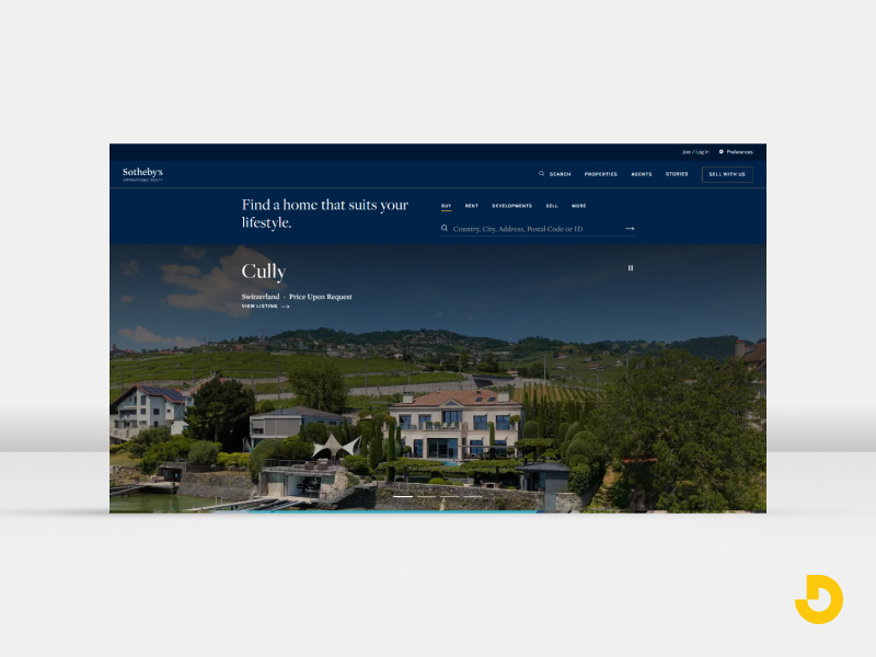
Sotheby's carries one of the oldest and most recognized names in luxury real estate, and its website design is built to match that weight. The brand does much of the work, so the design stays confident and uncluttered.
Lesson for your site: If your name carries recognition, let it lead. If it does not yet, borrow the restraint: fewer elements, better photos, more white space.
Type: Luxury brokerage
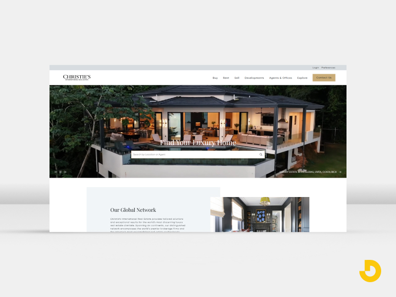
Christie's borrows more from art-world presentation than from typical real estate conventions, which fits its heritage. Listings are presented more like collected pieces than inventory.
Lesson for your site: Treat photography as the product. Large, carefully edited images create perceived value before any price appears.
Type: Luxury brokerage, Beverly Hills
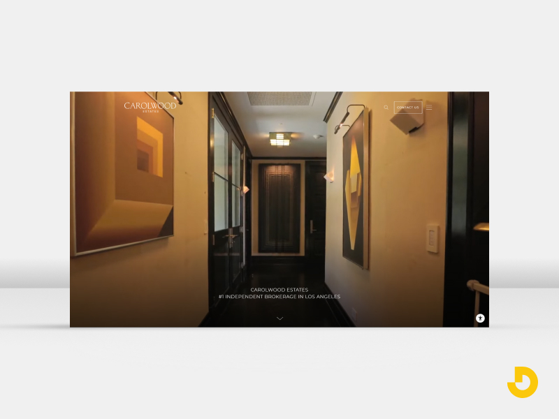
Carolwood operates in the Beverly Hills luxury market, where visitors expect polish and discretion. It appears in design roundups as an example of how luxury brokerages present high-end inventory.
Lesson for your site: In a high-end market, trust signals such as agent profiles, sold results, and clear contact paths matter as much as visuals.
Type: Boutique advisory
This site is noted for an editorial look, with magazine-style layouts presenting Hamptons properties. It reads more like a lifestyle publication than a database of listings.
Lesson for your site: Editorial layouts work when your inventory is distinctive. Pair them with a simple, visible search or inquiry option so style never blocks action.
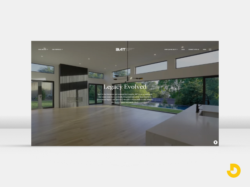
Type: Regional brokerage, Santa Barbara
Village Properties uses local real estate as design inspiration, signaling deep local roots and an understanding of what buyers in that area actually want.
Lesson for your site: Let your market shape the design: local imagery, neighborhood language, and regional color cues beat generic stock photography every time.
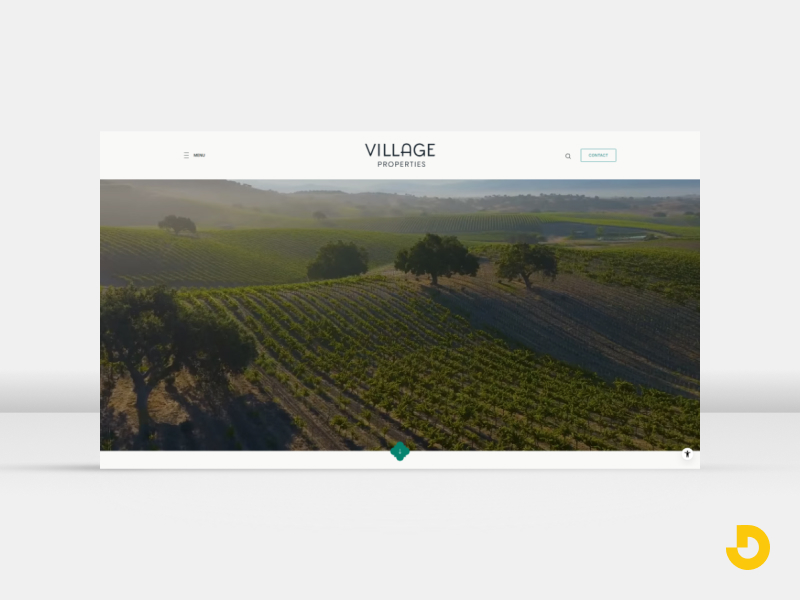
Type: Regional brokerage
Dwelling in Maine is frequently cited for building its brand voice directly into the design, so tone, copy, and visuals feel like one consistent personality.
Lesson for your site: Write your headlines and button text the way you speak to clients. Consistent voice makes a small brokerage feel distinctive.
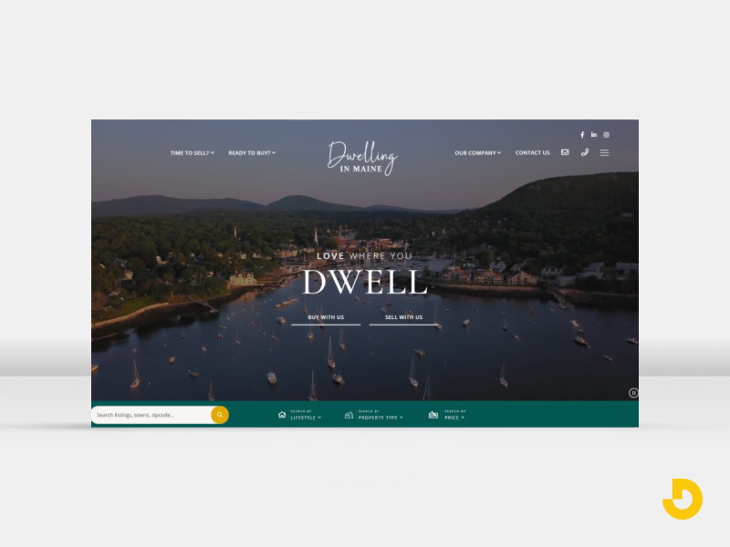
Type: Boutique brokerage
The Malibu Life appears in roundups as an example of a lifestyle-led landing page, where the place and the way of life take center stage ahead of individual listings.
Lesson for your site: If you serve a destination market, sell the lifestyle first and the properties second.
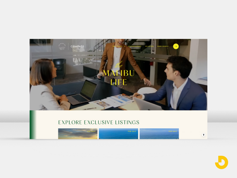
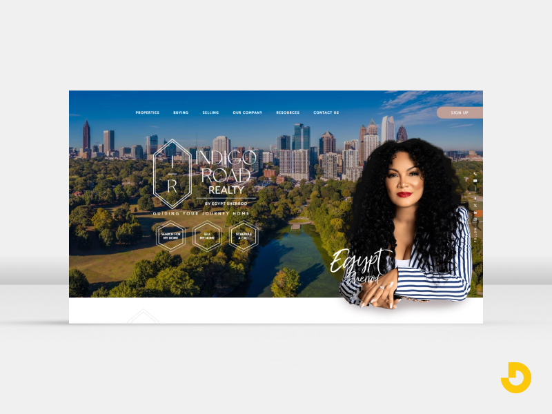
Type: Atlanta brokerage
Founded by HGTV personality and real estate expert Egypt Sherrod, Indigo Road Realty blends real estate with interior design inspiration. That combination appeals to buyers who view homes as lifestyle statements rather than just transactions.
Lesson for your site: Your background is a design asset. Weave your unique expertise into the layout and content instead of copying competitors.
Need modern real estate website design built around your brand?
Explore Custom Web Design →Real estate website design for agents works best when it puts one person's identity, results, and personality at the center. These personal-brand sites show different ways to do that.
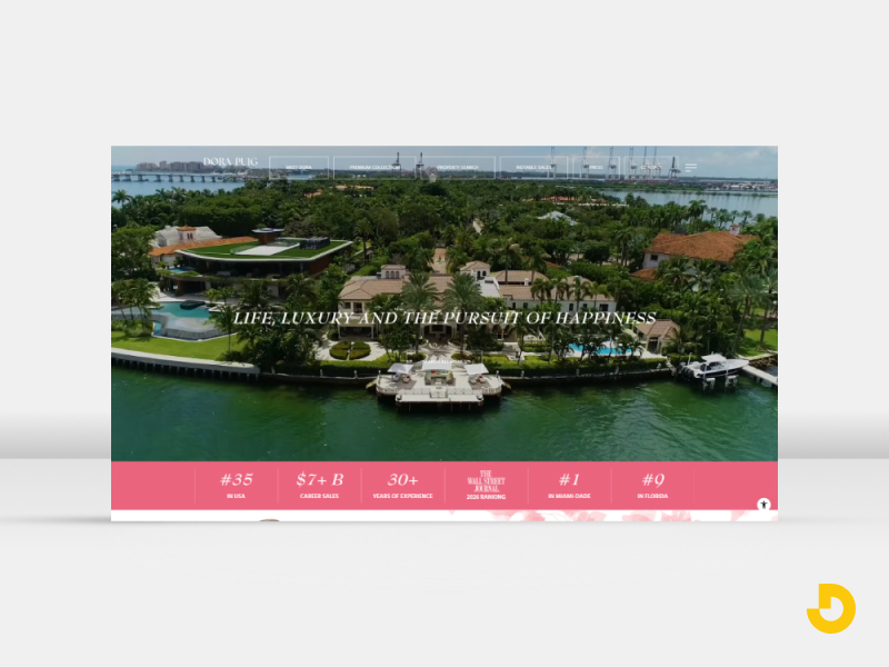
Type: Agent personal brand, Miami Beach
One analysis notes that the site's page title includes the agent's achievement, so credibility appears in the search result before a visitor even clicks. The site also uses many headings, giving search engines plenty of text to index.
Lesson for your site: Put your strongest credential in your title tag and headline, and structure pages with clear headings so they can rank.
Type: Agent personal brand
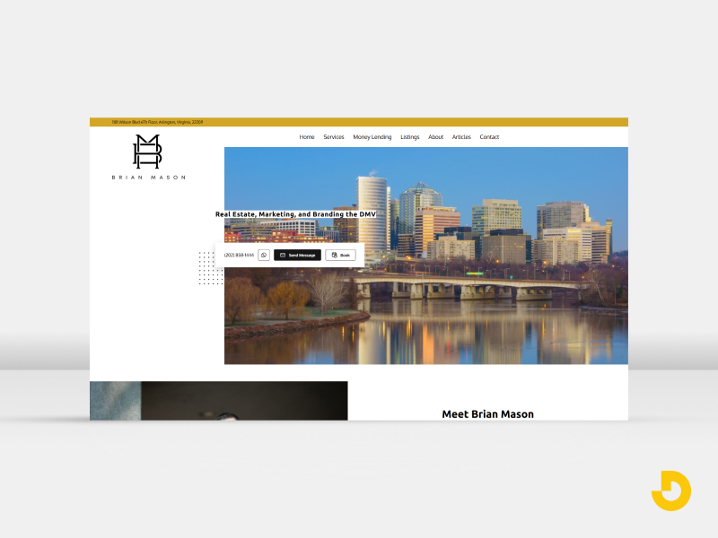
A minimalist monogram and a clean skyline hero keep this site simple and memorable, with nothing competing for attention.
Lesson for your site: A small, consistent mark and a single strong hero image can feel more premium than a busy slider.
Type: Agent personal brand
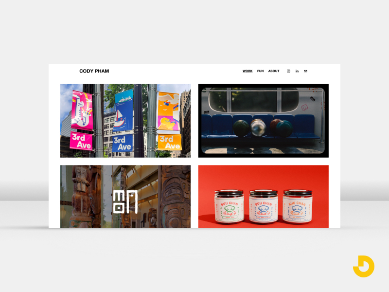
The aesthetic leans closer to a luxury-tech brand than a traditional real estate site, with a modern architecture hero and a lowercase wordmark. It suits an agent targeting younger, design-literate buyers.
Lesson for your site: Design for the client you want. A distinctive look attracts the right audience and filters out the wrong one.
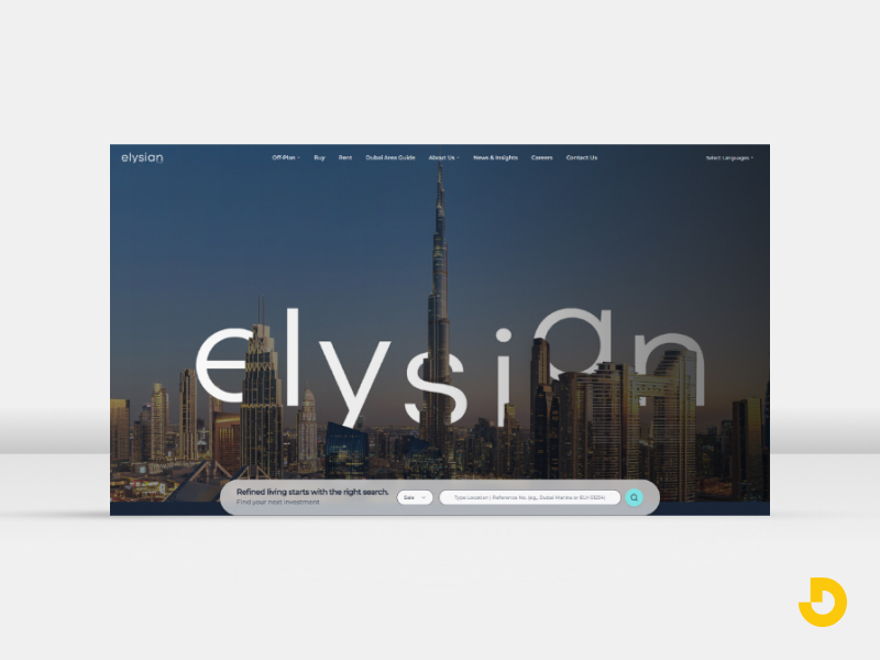
Type: Boutique firm
A gold serif wordmark over a dusk skyline hero gives Elysian an elegant, high-end tone that signals premium service immediately.
Lesson for your site: Typography does heavy lifting. A refined serif or a distinctive wordmark sets the tone faster than any paragraph of copy.
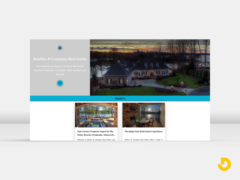
Type: Regional firm, Lake Norman
Rawlins uses a twilight luxury home photo and a lakeside color palette, tying the design to the specific place its clients want to live.
Lesson for your site: Build your color palette from your market, such as water, desert, mountains, or city lights, so the site feels local.
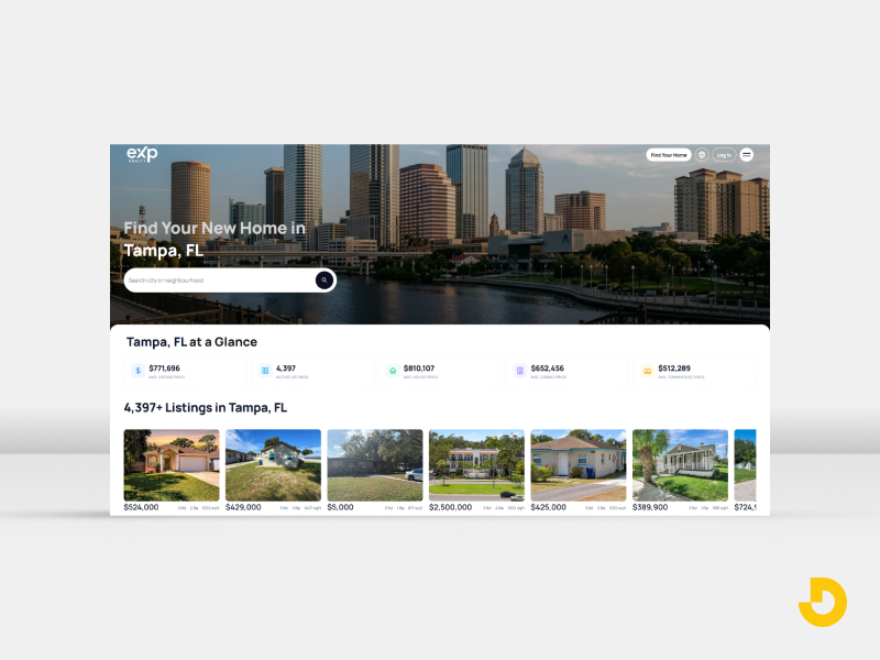
Type: National brand
eXp Realty is a large, national brand, and its home page is frequently cited as an example of how scale-focused sites present a broad offer to agents and consumers alike.
Lesson for your site: Large brands need strong navigation and clear paths for different audiences. If you serve buyers, sellers, and recruits, give each a clear entry point.
Type: National listing portal
Zillow is one of the most visited real estate sites in the US, and its design is built around one job: helping people find a home fast. Map-first search, strong photography, and simple filters keep the focus on the listings.
Lesson for your site: Make search the star. When visitors can filter by price, beds, and location in a few taps, they stay longer and look at more homes.
Type: Brokerage and portal
Redfin combines a brokerage with a listing portal, and its site design shows that. Clean map search, clear listing pages, and visible next steps, such as booking a tour, make the path from browsing to contact easy to follow.
Lesson for your site: Put the next step beside every listing. A visible tour or contact button turns interest into action.
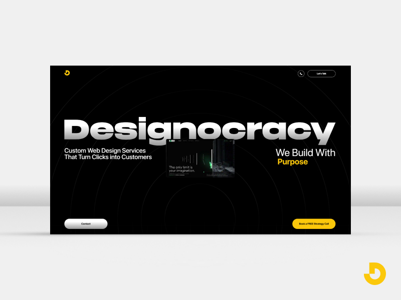
Type: Web design agency
Designocracy designs and builds real estate websites for agents, teams, and brokerages. Its work focuses on clear search, strong photography, local identity, and lead capture, the same ideas covered in the examples above.
Lesson for your site: A real estate website works best when design, SEO, and lead capture are planned together. Designocracy takes that approach on every real estate project.
Whatever your style, the strongest real estate website design best practices come down to a handful of repeatable decisions.
Visitors should be able to search listings or reach you without hunting. Place a property search or a clear call to action above the fold, and keep a persistent contact option available as people scroll. Sites that bury both tend to lose visitors early.
Mobile traffic now makes up the majority of real estate website visits according to recent industry roundups, so phone layouts are the main experience, not a secondary one. Test tap targets, forms, and galleries on real devices. Our guide on how to make a website mobile friendly covers the essentials.
Lead with a real photograph that visitors can place. Real local imagery builds more trust than stock skylines. Compress images so galleries load quickly without losing quality.
Recent sales, testimonials, awards, and years in the market belong near the top of key pages. Buyers and sellers are comparing you against other agents, and proof shortens that decision.
Neighborhood guides, market updates, and local lifestyle content help you rank for the searches people actually make and show genuine expertise. This is also where a site stops being a digital business card and starts working as a lead source.
Dedicated landing pages for home valuations, buyer consultations, and specific neighborhoods outperform a single generic contact form. See our breakdown of a high-converting landing page for the elements to include.
Fast load times, readable type, strong color contrast, descriptive image alt text, and logical headings help every visitor and support search visibility.
Ready to turn site visitors into booked consultations?
Talk to Designocracy About Your Site →These real estate website design trends 2026 show up repeatedly across the examples above and in current industry roundups. For a broader look beyond real estate, see our guide to top web design trends in 2026.
Modern real estate website design combines style with function. Use this table as a quick checklist when reviewing your own site:
| Element | Why It Matters | Design Idea |
|---|---|---|
| Hero section | Sets tone in seconds | One strong, local photo with a clear headline |
| Property search | Core visitor action | Visible above the fold, simple filters |
| Calls to action | Turns visits into leads | Persistent contact button, valuation offer |
| Agent profiles | Builds trust | Real photos, results, short bio |
| Neighborhood pages | Search visibility and expertise | Local guides with photos and market notes |
| Testimonials | Social proof | Short quotes near key actions |
| Mobile layout | Majority of visits | Thumb-friendly buttons, fast galleries |
| Lead forms | Captures intent | Short forms, clear promise |
If you are wondering how to design a real estate website from scratch, follow this order:
Budget matters too. For a realistic picture of what to expect, read our guide on how much a website costs in 2026.
The best real estate website design examples share a simple pattern: they know who they serve, reflect their market, make the next step obvious, and back it all up with proof. Use the examples above for inspiration, apply the best practices and trends that suit your audience, and remember that a distinctive site beats a polished but generic one.
Let's design a real estate website that stands out in 2026.
Start Your Project With Designocracy →