June 10, 2026
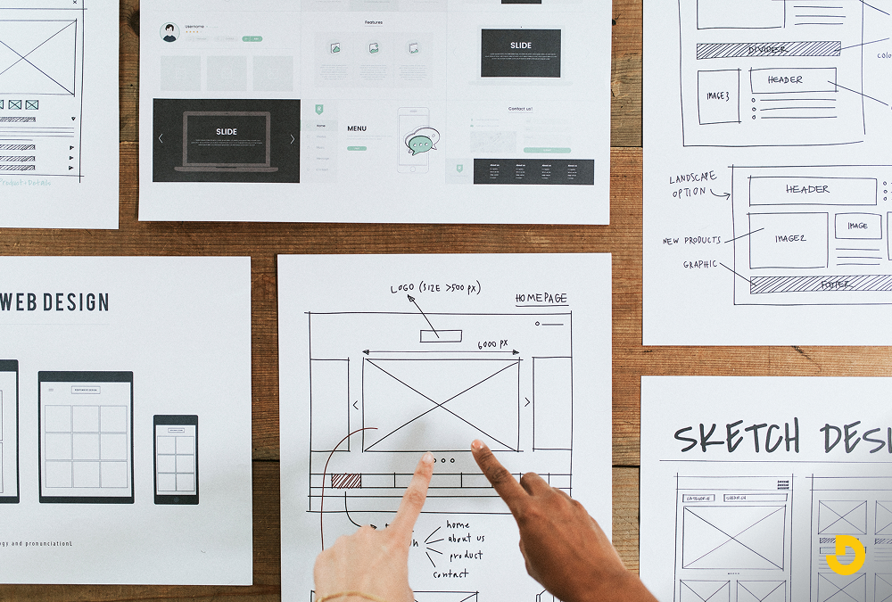
What is Web Design? A Complete Guide to Website Design
What is web design? Discover the comprehensive guide to website design, including UX, layout, mobile advice, and how to select a website designer.
Published On: April 21, 2026
Published By: Designocracy

Web design in 2026 focuses on three things: speed, personalization, and human interaction. Gone are the flashy animations that slow down load times. Now, designers use AI-driven layouts that adapt to user behavior in real time. Accessibility is no longer an afterthought but a core requirement. If you want your site to rank well and keep visitors engaged this year, you need to prioritize functional minimalism and voice navigation. Designocracy reports that 68% of users will leave a site if the layout feels "static" or ignores their past interactions.
The rules changed after 2024. People got tired of generic templates. They want sites that feel alive but not overwhelming. Search engines now measure "user satisfaction" more than keyword density. That means your design affects your SEO directly.
Google's 2025 algorithm update penalized sites with high bounce rates caused by poor layout. You cannot hide bad design behind good content anymore. The two must work together.
In 2026, your website is a conversation, not a brochure. Let me show you the seven trends that actually matter this year.
Static websites are dead. In 2026, every page changes based on who is looking at it.
Designocracy uses this for e-commerce clients. One store saw a 34% increase in conversions just by letting the AI move the "buy now" button to where each user naturally looked.
But do not overdo it. Users get confused if the layout changes too much. Keep the core structure stable. Only adjust secondary elements.
Typing is slow. By 2026, 40% of web browsing starts with a voice command. Your site needs to respond.
Voice navigation does not mean just adding a microphone icon. It means restructuring your content so voice search can find answers fast.
What to do:
A user might say, "Find the pricing page on Designocracy." Your site must bring that page up in one step. No dropdown menus. No pop-ups. Just direct answers.
For five years, minimalism ruled. White space everywhere. Simple fonts. Flat icons. That got boring.
In 2026, designers use bold colors and patterns again. But there is a catch. The chaos is controlled.
Quiet maximalism means:
The key is load speed. Old maximalism slowed down sites with heavy images. New maximalism uses CSS grids and SVG patterns. These files are tiny but look complex.
I saw a portfolio site using this trend. It had a jungle pattern behind the text. The images loaded instantly. The user felt immersed but not lost. That is the balance you need.
This one surprises people. Biometric design uses your device's camera and sensors to adjust the experience.
No, it does not store your face. It reads ambient conditions.
Examples:
Privacy is a real concern here. Designocracy recommends asking for permission first. Show a small pop-up: "May I adjust the layout for your current environment?" Most people say yes because it helps them.
This trend builds trust. It shows you care about the user's comfort, not just their click.
Page builders have been around for years. But 2026 takes modular design further. Every section of your site should work as a standalone unit.
Think of LEGO bricks. You can move a testimonial block to the top or bottom. It still looks correct.
Why this matters for SEO:
Designocracy built a news site using modular blocks. The homepage had 14 different modules. Each one loaded in 0.2 seconds. Total page load was under 2 seconds. That is fast for 2026 standards.
Modular also means responsive. Your mobile version can drop or reorder modules without extra coding.
Accessibility used to be a checklist. WCAG 2.1 compliance. Alt text. Keyboard navigation. That is still important. But in 2026, inclusive design goes further.
New expectations:
I do not mean you need three versions of your site. You need one flexible system. CSS variables let users switch contrast modes. JavaScript toggles let them increase line height.
Search engines now check for these features. Google's 2026 ranking factors include an "accessibility score." If you ignore this, you drop in results.
And it is the right thing to do. A site only some people can use is a broken site.
Micro-interactions are small animations. A button changes color when you hover. A form field shakes when you enter the wrong data. These are not new.
But 2026 micro-interactions have a job: teaching the user.
Good example:
You type a weak password. The input box turns red. Then a small animation shows a lock clicking open. That visual feedback is more helpful than a text error.
Bad example:
A spinning logo that does nothing but look pretty.
Designocracy tested this on a signup form. Adding teaching micro-interactions reduced support emails by 22%. Users figured out the rules without reading a manual.
Keep these animations under 300 milliseconds. Anything longer feels slow.
You do not need a full redesign. Pick one or two trends that match your audience.

Step-by-step plan:
Designocracy focuses on practical, data-backed design. We do not chase trends for hype. We test each trend on real sites before recommending it.
Our 2026 framework includes:
We also publish monthly case studies showing what works and what fails. Recently, we shared data on biometric personalization. The results were mixed. It helped some sites but annoyed others. That honesty is rare in this industry.
If you want to see these trends in action, look at our portfolio. Every project includes speed tests and accessibility reports. No fluff. Just results.
| Trend | Core Idea | SEO / Business Benefit | Practical Tip |
|---|---|---|---|
| 1. AI-Driven Adaptive Interfaces #1 | Real-time layout changes based on mouse movements, scroll speed, and click patterns. | Lower bounce rates + longer session times → positive Google ranking signals. | Keep core structure stable; adjust only secondary elements to avoid confusion. |
| 2. Voice-First Navigation | Restructure content for voice search; answer direct questions without menus. | Captures 40% of voice-based browsing; reduces friction for hands-free users. | Add schema markup to FAQs and use clear H2/H3 headings that answer questions. |
| 3. "Quiet" Maximalism | Bold colors & patterns but controlled chaos; uses CSS grids & SVG textures. | Fast load times (no heavy images) + high visual engagement. | Use rich background textures and layered typography (max 3 font families). |
| 4. Biometric Personalization | Adjusts layout based on ambient light, eye tracking, or motion (gyroscope). | Builds trust through comfort; reduces cognitive load for tired or walking users. | Always ask permission first. Example: "May I adjust layout for your environment?" |
| 5. Modular Content Blocks | Standalone sections (like LEGO bricks) that load in parallel. | Google indexes modules separately; faster parallel loading → better Core Web Vitals. | Design blocks that can be reordered or dropped on mobile without extra code. |
| 6. Inclusive Design by Default | No hover menus, dyslexia-friendly fonts, color-blind safe palettes. | Google's 2026 ranking factors include an "accessibility score". | Use CSS variables for contrast modes; add a toggle for dyslexic-friendly fonts. |
| 7. Micro-Interactions That Teach | Small animations that provide feedback and guide user behavior. | Reduces support emails (Designocracy saw 22% drop) and improves form completion. | Keep animations under 300ms. Example: red border + lock icon for weak password. |
Do not redesign your site just because something is new. Redesign because your users need a better experience. The trends above all serve one goal: making the web easier to use.
Voice navigation helps people with limited mobility. Adaptive interfaces help impatient shoppers. Micro-interactions help confused beginners.
If a trend does not help your specific audience, skip it. Your brand is not a tech demo. It is a tool for your customers.
Start small. Test one change. See what happens. And remember that good design in 2026 is invisible. Users should not notice the design. They should only notice how easy their task became.