July 13, 2026
How Much Does a Website Cost in 2026? A Full Pricing Breakdown
A professional website costs between $150 and $50,000 in 2026. The exact price depends entirely on who builds it and what specific features you need to launch.
Published On: April 13, 2026
Published By: Designocracy

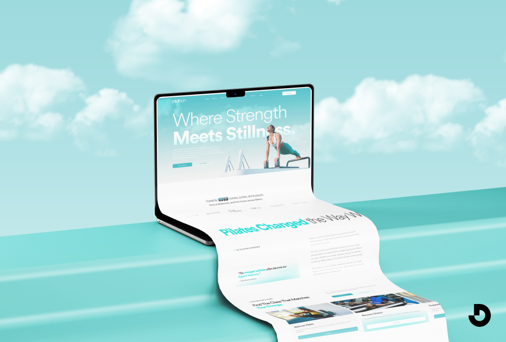
A high-converting ecommerce website design combines a mobile-first layout, fast loading speeds (under 2 seconds), clear navigation, high-quality product images, and a simple checkout process. Prioritize trust signals like reviews and security badges, use analytics to reduce friction, and ensure accessibility. The best designs reflect brand identity and remove unnecessary steps so shoppers buy quickly.
Your website is often the first thing people see. If it looks old or runs slow, they leave. 48% of internet users say website design is the most important factor in deciding if a business is credible. And 57% won't recommend a company with a poorly designed site.
That's a lot of lost business.
Good ecommerce design does more than look nice. It guides people to buy. It builds trust. It works on phones and computers. And it loads fast.
I've worked with ecommerce brands for years. Designocracy has built sites that convert browsers into buyers. Here's what actually works.
A good ecommerce web design services combine fast loading times, mobile-first responsiveness, clear navigation, high-quality product images, and a simple checkout process. It should reflect your brand consistently across all pages and include trust signals like customer reviews, security badges, and visible contact information. The best designs prioritize user experience over flashy elements, making it easy for shoppers to find products and complete purchases in as few steps as possible.
Most people shop on their phones. By 2027, mobile commerce will make up 62% of all ecommerce. If you don't build your site for small screens, you risk losing sales.
Mobile-first means designing for the phone first, then scaling up to desktop. Not the other way around.
Here's what that looks like:
Before launching, test the whole purchase process on your phone. Go from landing page to confirmation. If anything feels awkward, fix it.
People don't wait. A slow site kills conversions.
The main culprits are images and videos. They're also the easiest to rectify

Test your site with Google PageSpeed Insights or GTmetrix. Both tools show you exactly what's slowing things down.
Your site should look like it belongs to you. Not like a template.
That means consistent colors, fonts, and tone across every page. If your logo is clean and modern, don't use playful handwritten fonts elsewhere. If you sell rugged outdoor gear, your site should feel tough, not delicate.
Branding builds recognition. Recognition builds trust. And trust makes people comfortable handing over their credit cards.
If people can't find what they want, they leave. It's that simple.
Categories should make sense. Use terms your customers actually search for. If you sell clothing, "Men's" and "Women's" are clear. "Collections" is vague.
Add filters for size, color, price, and other relevant attributes. Especially if you have a large catalog.
Search matters too. Make it visible. And make it work. If someone searches for "black sneakers," show them black sneakers. Not a page of random products.
This is where people decide to buy. Give them what they need.
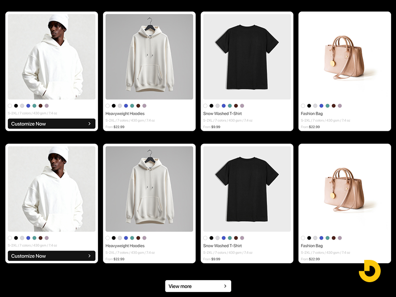
High-quality images. Use white backgrounds to highlight details. Add lifestyle shots so people can imagine using the product. Show multiple angles. Include zoom functionality.
Clear descriptions. Don't just list features. Explain benefits. "500-thread count cotton" is a feature. "Soft, breathable sheets that keep you cool at night" is a benefit.
Pricing and availability. Be clear. If something is backordered, say so upfront.
Reviews. People trust other shoppers. Show reviews prominently. Even a few good reviews help.
Calls to action. Buttons should say exactly what happens. "Add to Cart" is clear. "Learn More" is not.
This is where sales happen. Or die.
Every extra step loses customers. Keep it simple.
Also, offer multiple payment options. Credit cards, PayPal, Apple Pay, and buy now, pay later services like Klarna or Affirm. 10% of customers abandon carts if they don't see enough payment methods.
New customers don't know you. You have to earn their trust.
Security badges. Show SSL certificates and payment security icons. Especially near checkout.
Contact information. Display phone numbers, email addresses, or chat options. Real support reassures people.
Return policy. Make it easy to find. A clear return policy removes risk.
Customer reviews. As mentioned, they matter. Feature them.
About page. Tell your story. People connect with other people, not faceless companies.
Shoppers expect sites to recognize them. It's not a luxury anymore.
You don't need complex tech to do this.
Even small touches make a difference. When people feel understood, they're more likely to return.
An accessible site works for everyone. That includes people with disabilities.
Good accessibility also helps SEO. And it's the right thing to do.
Basic steps:
Following Web Content Accessibility Guidelines (WCAG) covers most of this.
You don't have to guess what works. Your analytics will tell you.
Look at where people drop off. If many people leave the shipping page, it may be because shipping costs are too high or delivery times are unclear.
Run A/B tests. Try two versions of a button, a headline, or a layout. See which one performs better. Then keep the winner and test something else.
Test one thing at a time. Otherwise you won't know what caused the change.
The platform you build on affects what you can do. Some lock you into rigid templates. Others give you room to grow.
Designocracy typically recommends platforms that balance flexibility with ease of use. BigCommerce, Shopify, and WooCommerce each have strengths.
BigCommerce offers built-in features like:
Shopify is simple to start with. WooCommerce gives you control but requires more maintenance.
The right platform depends on your business size, budget, and technical comfort level.
Looking at what works helps. Here are a few strong ecommerce sites and why they work.
AS Colour. Clean and minimal. White background with bold product photos. Navigation is simple. The products speak for themselves.
UPLIFT Desk. It lets you customize a standing desk directly from the homepage. That's smart. It shows what they do without making you search.
Coco Republic. Feels like a high-end showroom. Warm colors, elegant fonts, and room-style navigation make browsing feel intentional.
Mizuno USA. Uses action photography. The site feels athletic. Product pages include specs, sizing guides, and technical details that serious athletes want.
Music Direct. Content-rich. This site positions itself as an authority, not just a store. Detailed specs and expert commentary help shoppers make informed decisions.
I see these all the time. Avoid them and you're ahead of most.
| Design Area | Key Recommendations | Why It Matters / Stats |
|---|---|---|
| Mobile-First Design | Design for phones first, then scale to desktop. ✅ Large tappable buttons ✅ Readable text without zoom ✅ Simple navigation & short forms |
Mobile commerce = 62% of all ecommerce by 2027. If your site isn’t mobile-friendly, you lose sales. |
| Site Speed | ✅ Compress images (WebP format) ✅ Lazy loading ✅ Use a CDN ✅ Reduce heavy scripts |
Slow pages kill conversions. Test with Google PageSpeed Insights or GTmetrix. |
| Brand Consistency | Use same colors, fonts, and tone across all pages. Avoid template look. Match brand personality (e.g., rugged vs elegant). | Branding builds recognition → trust → higher willingness to buy. |
| Clear Navigation | ✅ Logical categories (use customer terms) ✅ Filters (size, color, price) ✅ Visible & accurate search bar |
If people can’t find products, they leave immediately. |
| Product Pages | ✅ High-quality images + zoom + lifestyle shots ✅ Benefit-driven descriptions (not just features) ✅ Reviews, clear pricing, availability ✅ Strong CTA: “Add to Cart” |
This is the final decision point. Detailed pages remove hesitation. |
| Simplified Checkout | ✅ Guest checkout ✅ Progress indicators ✅ One-page checkout ✅ Minimal form fields ✅ Multiple payment methods (Apple Pay, PayPal, BNPL) |
10% of customers abandon cart if they don’t see enough payment options. Every extra step loses sales. |
| Trust Signals | ✅ Security badges (SSL, PCI) ✅ Visible contact info & return policy ✅ Customer reviews & About page |
48% of users say design credibility depends on trust signals. New customers need reassurance. |
| Personalization | ✅ Recently viewed items ✅ Recommendations based on past purchases ✅ Location-based shipping info |
Small touches make shoppers feel understood → higher return rate. |
| Accessibility (WCAG) | ✅ Alt text for images ✅ Sufficient color contrast ✅ Keyboard navigation ✅ Descriptive link text |
Accessibility is a ranking factor + legal/ethical best practice. Expands audience. |
| Data & A/B Testing | Use analytics to find drop-off points. Run A/B tests (button color, headline, layout). Test one variable at a time. | Data removes guesswork. Continuous improvement beats redesigning from scratch. |
| Platform Choice | ✅ BigCommerce: built-in features, no transaction fees ✅ Shopify: easiest start ✅ WooCommerce: full control (more maintenance) |
Platform affects flexibility, costs, and scalability. Match to business size & technical skills. |
| Examples That Work | AS Colour (minimal), UPLIFT Desk (customization on homepage), Mizuno USA (action photography + specs), Music Direct (authoritative content). | Learn from real ecommerce leaders: clean UX, product-focused design, trust builders. |
| 🚫 Common Mistakes | ❌ Pop-ups that interrupt immediately ❌ Auto-playing video ❌ Hidden desktop menus ❌ Tiny fonts ❌ Too many form fields ❌ Uncompressed slow images |
|
Good ecommerce design isn't about flashy effects or complex animations. It's about helping people buy.
Start with mobile. Make it fast. Show your brand clearly. Keep navigation simple. Give product details people need. Remove friction from checkout. Build trust with reviews and security badges.
Then use data to make it better over time.
If you're building a new site or fixing an existing one, focus on these fundamentals first. They matter more than any trend.
At Designocracy, we've seen what works across hundreds of ecommerce sites. The ones that perform best aren't the fanciest. They're the ones that make it easy to buy. That's the goal. Everything else is secondary.