
June 23, 2026
What Are Cloud Service Providers?
A cloud service provider, or CSP, is an IT company that provides on-demand, scalable computing resources like computing power, data storage, or applications.
Published On: May 15, 2026
Published By: Designocracy
Most people now browse the web on their phones. If your site isn't ready for that, you lose visitors. They leave before the page loads. Or they struggle to click tiny buttons. That hurts your business.
Google knows this. So they rank mobile-friendly sites higher. If you ignore mobile users, you ignore most of your traffic.
Here's how to fix it. These steps work for any site. You don't need to be a developer.
A few years ago, the desktop was king. Not anymore. Mobile traffic passed desktop around 2016. Now it's not even close.
Google uses mobile-first indexing. That means they look at your mobile site first. If it's broken or slow, your rankings drop.
But SEO isn't the only reason. People expect a smooth experience. They get frustrated with zooming and pinching. They want text they can read and links they can tap.
If your site isn't mobile friendly, they go to a competitor. Simple as that.
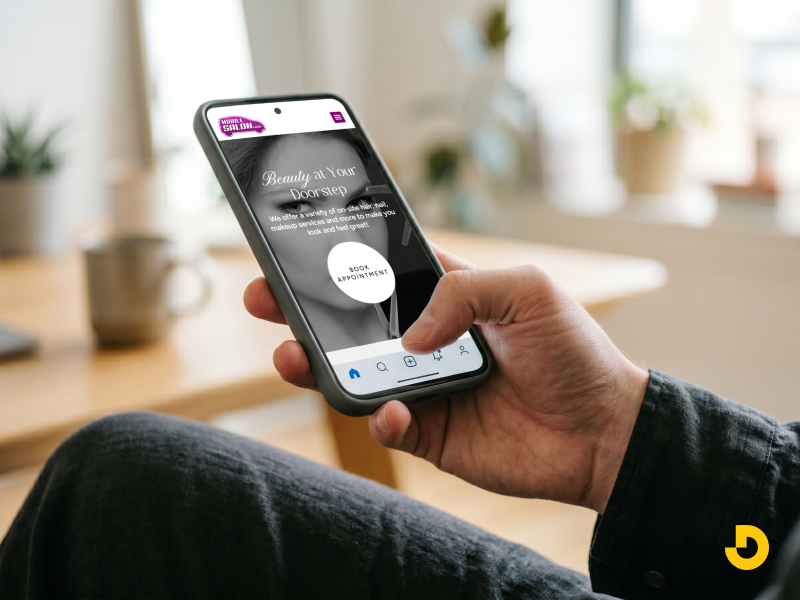
What is a mobile friendly website? A mobile friendly website automatically adjusts to fit any screen size. This means no horizontal scrolling, no tiny text, and no broken layouts. You achieve this with responsive design, which uses flexible grids and images. When a site is mobile-friendly, visitors stay longer and complete more actions, like buying something or filling out a form. Google confirms that mobile friendliness is a ranking factor, so updating your site directly improves your search visibility.
The best long-term solution is responsive design. One site. One set of content. It works on phones, tablets, and desktops.
Responsive web design services handle the technical side. They build your site with flexible layouts. Images resize. Text reflows. Menus change for touch.
You don't need a separate mobile site. That old approach caused problems. You had to maintain two versions. Content got out of sync. Links broke.

Responsive website design services solve that. You update one page, and every device shows the correct version.
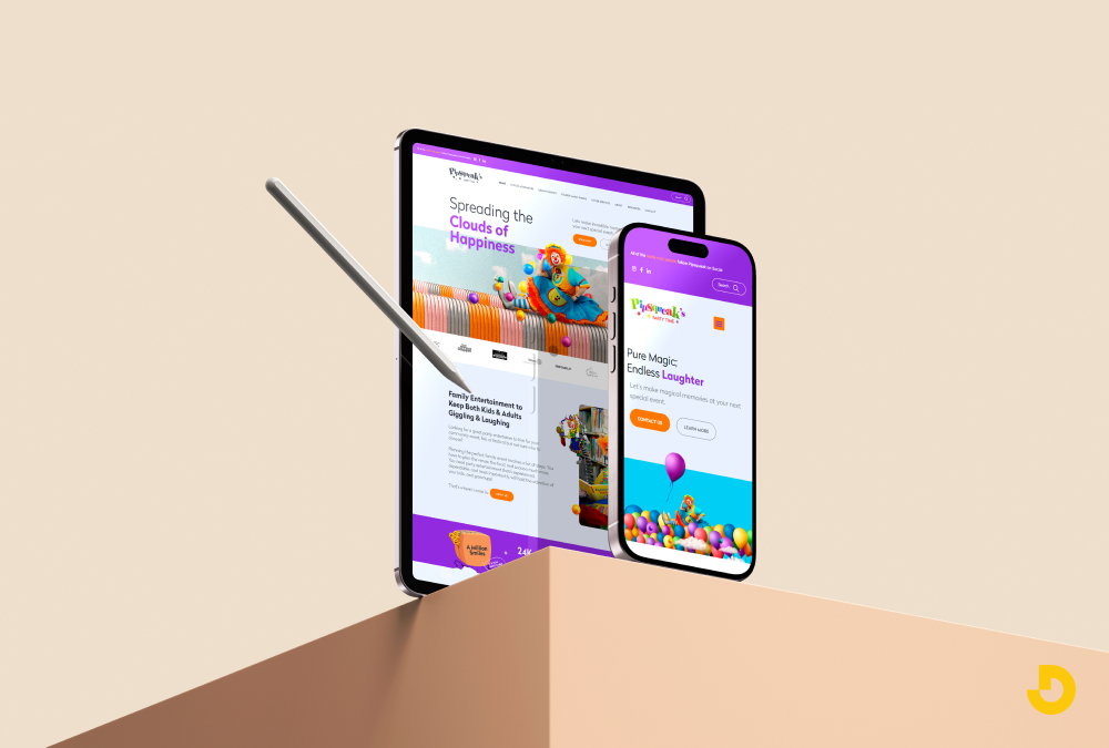
If you work with a company like Designocracy, they focus on responsive builds from the start. That saves you time and money later.
Not everyone hires a developer. Many people use WordPress, Wix, or Squarespace. That's fine. Just pick the right theme.
Most modern themes claim to be responsive. Some are lying. Check the demo on your phone before you buy.
Load the demo on your phone. Pinch and zoom. Tap buttons. Does it feel smooth? Or do things overlap?
Free themes often have mobile issues. Paid themes from reputable sellers are usually better. But still test them.
Frameworks like Bootstrap or Foundation help if you build from scratch. They include responsive grids. You don't have to guess the code.
Mobile screens are small. You can't fit everything from your desktop site. And you shouldn't try.
Good mobile website design strips away the noise. Fewer images. Shorter text blocks. Big buttons.
Ask yourself what mobile users actually want. They probably don't need your full "About Us" history. They want your phone number, address, or product details.
Cut the clutter. Hide secondary content behind expandable menus. Use accordions for FAQs. This keeps the main view clean.
One common mistake is keeping pop-ups on mobile. Google penalizes intrusive pop-ups. They make the page hard to use. Remove them or set them to appear only on desktop.
Fat fingers are real. A desktop link might be 10 pixels wide. On a phone, that's impossible to tap without zooming.
Make buttons at least 44x44 pixels. That's Apple's recommendation. Give them space around each other so you don't hit the wrong one.
Fonts need to be bigger too. 16 pixels is the minimum for body text on mobile. Headlines can be larger. Anything smaller forces users to zoom.
Don't rely on hover effects. There's no hover on a touch screen. Use active states instead. Change the button color when someone taps it. That gives clear feedback.
Emulators are useful. But they can miss things. A real phone shows you the truth.
Test on an iPhone and an Android. Different screen sizes too. Small phones like the iPhone SE. Large ones like the Galaxy Ultra.

Check these things:
Ask friends to test it. They'll find issues you miss. Watch them use the site. Don't explain anything. Just see where they get stuck.
Google's Mobile-Friendly Test tool is free. Enter your URL, and it shows problems. It also gives a screenshot of how Google sees your mobile page.
A responsive layout doesn't matter if the page takes 5 seconds to load. Mobile connections vary. Some people have fast 5G. Others have slow 3G in a bad coverage area.
Speed is a ranking factor. Google PageSpeed Insights scores your site. Aim for over 90 on mobile.
Here's what slows down mobile sites:
Compress images before uploading. Use WebP format when possible. Lazy load images below the fold. That means they only load when the user scrolls to them.
Remove unnecessary plugins. Each one adds code. That code has to download and run. Keep only what you truly need.
People hold their phones with one hand. Their thumb does the work. Most people are right-handed. But left-handed people exist too.
Put primary navigation at the bottom of the screen. That's where thumbs naturally rest. Top navigation is harder to reach on tall phones.
A sticky bottom bar works well for key actions. Home, search, cart, account. Don't overload it. Four or five icons maximum.
Use a hamburger menu for secondary links. That icon with three lines. It saves space. Just make sure it's easy to tap and the menu opens fast.
Avoid dropdown menus on mobile. They're too finicky. Use a separate page or expandable sections instead.
Filling out forms on a phone is annoying. Long forms make people leave. Shorten every form you can.
Use input types that trigger the right keyboard. For phone numbers, use type="tel". That brings up the number pad. For email, type="email". The keyboard shows the @ symbol.
Auto-fill helps a ton. Browser auto-fill works when you name your fields properly. Use standard names like "email" and "address".
For checkout, offer digital wallets. Apple Pay and Google Pay reduce typing. One tap fills everything.
If your site uses pop-ups for email signups, set a delay. Don't show them immediately on mobile. Wait 30 seconds or trigger them on exit intent.
Google Search Console has a Mobile Usability report. It shows you pages with specific mobile errors.
Common issues include:
Fix these errors one by one. The report tells you exactly which page and what's wrong.
Once you fix them, submit the page for re-crawling. Google will update its assessment.
You can do basic fixes yourself. But complex issues need experts.
Companies offering responsive web design services handle everything. They audit your current site. They rebuild the layout. They test on dozens of devices.
Designocracy provides these services for business owners who don't have time. You describe the problem. They produce the solution. And they follow Google's best practices.
Sometimes the cheaper route is paying a professional once rather than struggling for months.
Mobile friendliness isn't one task. It's ongoing.
Every time you add a new page or feature, test it on mobile. New plugins can break your layout. Updated themes might change button sizes.

Set a monthly reminder to run Google's mobile test again. Things change. What worked in January might break by June.
Keep checking your analytics. Look at mobile bounce rates. If they spike, something changed. Find it and fix it.
| Factor | What "Good" Looks Like | How to Test / Fix |
|---|---|---|
| Responsive Layout | No horizontal scrolling. Content reflows on any screen size. Columns stack vertically on phones. | Use Google’s Mobile-Friendly Test. If it fails, switch to a responsive theme or hire a developer for custom CSS. |
| Touch Targets (Buttons & Links) | Tap targets are at least 44x44 pixels. Adequate spacing between clickable items. | Inspect with browser dev tools. Increase button padding. Use CSS: min-height:44px; min-width:44px; |
| Font Size & Readability | Body text minimum 16px. Headings larger. No zooming required for reading. | Check on a real phone. Increase base font size. Avoid fixed pixel sizes on text containers. |
| Page Load Speed | Loads in under 2.5 seconds on mobile. Core Web Vitals pass (LCP, FID, CLS). | Run PageSpeed Insights. Compress images, remove unused scripts, enable caching. |
| Mobile Forms & Inputs | Short forms. Proper input types (tel, email). Large input fields. Easy error messages. | Test filling a form on phone. Use inputmode and autocomplete attributes. |
| Navigation (Thumb-friendly) | Primary actions reachable with one thumb. No complex dropdowns. Sticky bottom bar for key links. | Watch someone use your site on a phone. Move critical links to bottom or use a hamburger menu. |
| No Intrusive Pop-ups | Pop-ups do not block main content on mobile. Easy to close. Not shown immediately. | Check on mobile. Set pop-up delay (30+ seconds) or disable pop-ups on phones entirely. |
Run through this checklist:
Get these right, and your mobile visitors will stay. They'll convert better. And Google will rank you higher.
Start with one fix today. Change a button size or compress an image. Small steps add up. Your mobile traffic will thank you.