
June 10, 2026
What is Web Design? A Complete Guide to Website Design
What is web design? Discover the comprehensive guide to website design, including UX, layout, mobile advice, and how to select a website designer.
Published On: April 30, 2026
Published By: Designocracy
Web design is the process of planning and building websites that work well on phones, tablets, and computers. It covers layout, colors, fonts, navigation, and loading speed. Good web design helps visitors find what they need fast. It also helps businesses rank higher on Google. In 2026, web design includes accessibility features, mobile-first layouts, and simple user paths. Without good design, even great content gets ignored.
Most people think web design is just about making things pretty. That's only half of it. Web design also covers how a site works. A beautiful site that takes ten seconds to load is not well designed. A simple site that answers a question in two clicks is excellent design.

I've worked with sites that looked average but converted visitors into customers. Why? Because the design focused on user needs, not on flashy effects.
Web design sits at the intersection of three things: visual appeal, technical performance, and user psychology. Miss any one, and your site will underperform.
Let me break down what actually goes into web design. These are the elements every site needs.
Layout is where things sit on the page. The logo goes top left. The menu goes top right. Main content in the middle. Sidebar on the right or left. That's a standard layout.
But layout also means hierarchy. What do you want the user to see first? That should be the most important thing. A headline. A product image. A call to action button.
Bad layouts confuse people. They don't know where to click or what to read. Good layouts guide the eye naturally.
Colors create mood. Blue feels calm and trustworthy. Orange feels urgent and energetic. But color is also practical. Text needs enough contrast against the background. Light gray text on a white background is unreadable.

In 2026, contrast ratios matter for accessibility and SEO. Google checks if your site is readable. Use tools to test your contrast. It's an easy fix.
Typography means fonts and text styling. You don't need fancy fonts. You need readable fonts. Sans-serif fonts like Arial or Inter work well on screens. Keep body text at 16 pixels or larger. Line height around 1.5 makes paragraphs easier to read.
Avoid too many font sizes. Stick to three: one for headings, one for subheadings, one for body text.
Navigation is how users move around your site. Menus, links, buttons, and breadcrumbs all count. Good navigation answers one question: where do I go next?
If users can't find your pricing page or contact form, they leave. It's that simple. Navigation should be consistent across all pages. Don't hide the menu behind strange icons. Label things clearly.
Speed is part of web design. A slow site frustrates users and hurts rankings. Google measures Core Web Vitals. These are real metrics about loading time, interactivity, and visual stability.
Design choices affect speed. Large images slow you down. Too many custom fonts add load time. Heavy animations cause delays. Good designers balance beauty with performance.
Search engines cannot see design the way humans do. But they measure what design does to user behavior.
If your design causes high bounce rates (people leaving immediately), Google notices. If your design keeps people on the page for three minutes, Google notices that too.
Good design improves:
These signals tell Google your site is valuable. And that helps you rank higher.
More than 60% of web traffic comes from phones. If your site looks bad on a small screen, you lose most of your audience.
Responsive design means your layout adjusts to any screen size. Text resizes. Menus become collapsible. Images scale down. You don't need a separate mobile site. One flexible design works everywhere.
Mobile-first design is a specific approach. You design for the smallest screen first. Then you add features for larger screens. This forces you to focus on what really matters.
Mobile-first checklist:
Accessible design means people with disabilities can use your site. This includes people who are blind, have low vision, or cannot use a mouse.
Accessibility is not optional anymore. In many places, it's the law. And Google prioritizes accessible sites.
Simple accessibility fixes:
These changes help everyone, not just people with disabilities. Clear headings help all readers. Good color contrast helps people in bright sunlight.
User experience is how someone feels when using your site. Web design directly shapes that feeling.
Good UX means:
Bad UX creates frustration. Pop-ups that won't close. Forms that erase your data. Links that go to the wrong place.
I've seen sites lose sales because the checkout button was hard to find. That's not a technical bug. That's a design failure.
Professional web design follows a process. It's not just opening a tool and guessing.
Typical workflow:
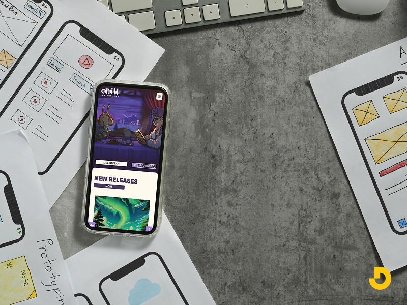
Designers use tools like Figma, Adobe XD, or Sketch for mockups. Developers then turn those designs into HTML, CSS, and JavaScript.
But you don't need to know code to understand web design. You just need to know what works.
Here are mistakes I see all the time.
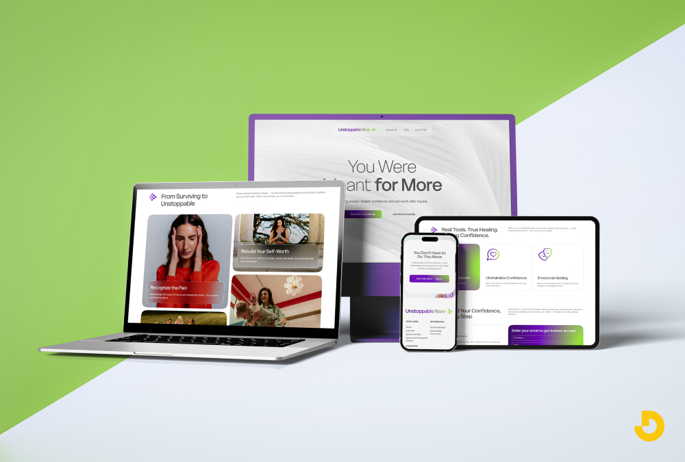
Designocracy builds websites that balance form and function. Their process starts with user research, not with color palettes. They ask: what does the visitor need to accomplish?
From there, they design layouts that remove friction. Menus are clear. Forms are short. Buttons are obvious. They also prioritize loading speed. A beautiful design that loads in 1.5 seconds beats a stunning design that loads in 5 seconds.
Designocracy also focuses on conversion design. That means every element on the page has a job. No decorative fluff. No confusing animations. Just clear paths from arrival to action.
Their clients include small businesses and healthcare providers. In every case, they measure success by user behavior, not by subjective opinions. If the design doesn't work, they change it.
| Component | What it means (plain English) | Do's & Don'ts | Why it matters for SEO / Users |
|---|---|---|---|
| Layout & structure | Where elements sit on the page (logo, menu, content, buttons). Hierarchy guides the eye to what's most important. | ✅ Put main headline & CTA above fold. ❌ Don't hide navigation or scatter content randomly. |
Clean layout lowers bounce rate. Google sees better engagement signals. |
| Color & contrast | Colors create mood; contrast makes text readable. Light gray on white? Unreadable. | ✅ Use accessible contrast (WCAG 4.5:1 for body text). ❌ Avoid low-contrast combos. |
Google prioritizes accessibility. High contrast improves time on page. |
| Typography | Fonts and text styling. Readable sans-serif fonts (Arial, Inter). Minimum 16px body text. | ✅ Stick to 3 font sizes: heading, subheading, body. ❌ Don't use fancy script fonts for paragraphs. |
Legible text keeps readers on site longer. Reduces frustration. |
| Navigation | Menus, links, breadcrumbs — how users move around. Should answer "where do I go next?" | ✅ Label menu items clearly. Use consistent placement. ❌ Avoid hidden hamburger icons on desktop. |
Easy navigation reduces exit rate. Helps search engines crawl structure. |
| Loading speed | How fast your site loads. Core Web Vitals matter. A 2-second delay increases bounce rates. | ✅ Compress images, limit custom fonts. ❌ Don't overload with animations or sliders. |
Google ranks faster sites higher. Speed = conversions. |
| Mobile-first / responsive | Design for smallest screen first. Site adapts to any device (phone, tablet, desktop). | ✅ Large tap targets, readable without zoom. ❌ Avoid hover-only effects (touch fails). |
Over 60% of traffic is mobile. Mobile-friendly gets priority in search. |
| Accessibility (a11y) | People with disabilities can use your site. Alt text, keyboard nav, proper headings. | ✅ Add alt text, heading order (H1→H2→H3). ❌ Avoid flashing animations, missing form labels. |
Legal requirement. Google prefers accessible sites. Wider audience reach. |
| User Experience (UX) | How someone feels using your site. Few clicks, clear error messages, easy undo. | ✅ Confirm form submissions, show loading feedback. ❌ Don't erase form data on error. |
Good UX = more pages per session & return visits. Positive signals for ranking. |
| Designocracy approach | User research first, not decoration. Clear layouts, fast load, conversion-focused design. | ✅ Remove friction, test behavior, iterate. ❌ No decorative fluff or confusing animations. |
Designocracy measures success by real user actions — not subjective opinions. |
| Common mistakes to avoid | Auto-play videos, too many pop-ups, broken links, hidden icons, slow carousels. | ✅ One clear pop-up max, test links weekly. ❌ Don't autoplay sound or hide menu behind abstract shapes. |
Mistakes hurt trust and increase bounce rate. Google penalizes poor usability. |
| Trends that work (2026) | Functional minimalism, voice navigation, modular design, micro-interactions. | ✅ Use micro-interactions (button feedback). ❌ Avoid heavy animations that slow loading. |
Trends that improve user control = better retention & CTR. |
Trends come and go. But some trends stick because they solve real problems.
These trends help users, not just look cool.
You don't need a degree to understand web design. Start with these basics.
Free resources exist everywhere. YouTube has tutorials. Blogs break down design principles. You can learn the fundamentals in a few weeks.
But understanding design and doing it professionally are different. For a business site, hire experts. A bad DIY design costs you more in lost sales than you save on design fees.
Web design is not magic. It's a set of practical decisions. Where does the button go? What color is the link? How fast does the page load? Each choice affects whether a user stays or leaves.
Good web design is invisible. Users don't notice it because nothing gets in their way. They find what they need and move on. That's success.
Bad web design is loud. Users notice confusion, slowness, and broken features. They remember the frustration.
If you want a site that works, focus on clarity over creativity. Fast over fancy. Simple over complex. And if you need help, agencies like Designocracy can guide you. They focus on results, not on trends.
Start with small improvements. Test one change at a time. Measure what happens. That's how good design happens. Not all at once. Step by step.