June 23, 2026
What Are Cloud Service Providers?
A cloud service provider, or CSP, is an IT company that provides on-demand, scalable computing resources like computing power, data storage, or applications.
Published On: March 25, 2026
Published By: Designocracy

A landing page is a dedicated web page designed for one purpose: to convert visitors into leads or customers. Unlike a homepage full of distractions, a focused landing page removes clutter and guides visitors toward a single, clear call to action. When done right, it becomes one of your most effective marketing tools.
A high-converting landing page combines a clear headline, a compelling offer, and a strong call to action. It loads quickly, works perfectly on mobile, and speaks directly to a specific audience's needs. The goal is to remove friction and make the next step—whether signing up, buying, or downloading—feel like the natural thing to do. Successful landing pages are built on research, tested continuously, and optimized for both user experience and conversion goals.
A landing page converts when it matches visitor intent with a seamless experience. The page must deliver exactly what was promised in the ad or link that brought the user there. If the promise and the page don't align, visitors leave.
Beyond that, conversion depends on clarity. People need to understand the offer within seconds. They need to trust the source. And they need a simple path to take action. When these elements work together, the page performs.
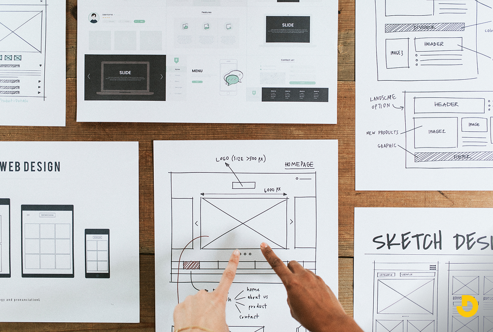
Before opening a design tool, define who you're talking to. Market research is the foundation of any effective landing page. You need to know what your audience wants, what problems they face, and how your offer solves those problems.

This includes:
If you serve different customer groups, create separate landing pages for each. Companies with 30 or more landing pages generate up to seven times more leads than those with fewer than 10. More targeted pages mean more relevant messaging.
You have two main options for building landing pages:
Choose based on your budget, technical comfort, and how much control you need over design and testing.
A user-friendly design removes obstacles. Visitors shouldn't have to figure out where to click or what to read. Every element on the page should support the main goal.
Key design elements include:
You have about 54 seconds to keep someone's attention. Your copy needs to be clear and direct.
Start with a powerful headline. It should immediately communicate value. For example, instead of "Welcome to Our Service," use "Get Professional Advice in Minutes."
Address pain points early. Acknowledge the problem your audience faces. Show that you understand their frustration.
Focus on benefits, not features. Instead of listing specifications, explain how the product makes life better.
Add social proof. Testimonials and reviews reassure visitors that others have had a good experience.
Preemptively address objections. If someone might worry about commitment, mention a free trial or money-back guarantee near the CTA.
Write like you speak. Avoid jargon. Use short sentences. Keep the tone approachable.
Your CTA is the most important element on the page. It tells visitors what to do next.
Effective CTAs are:
Avoid clutter around the CTA. Any distraction can reduce the chance someone clicks.
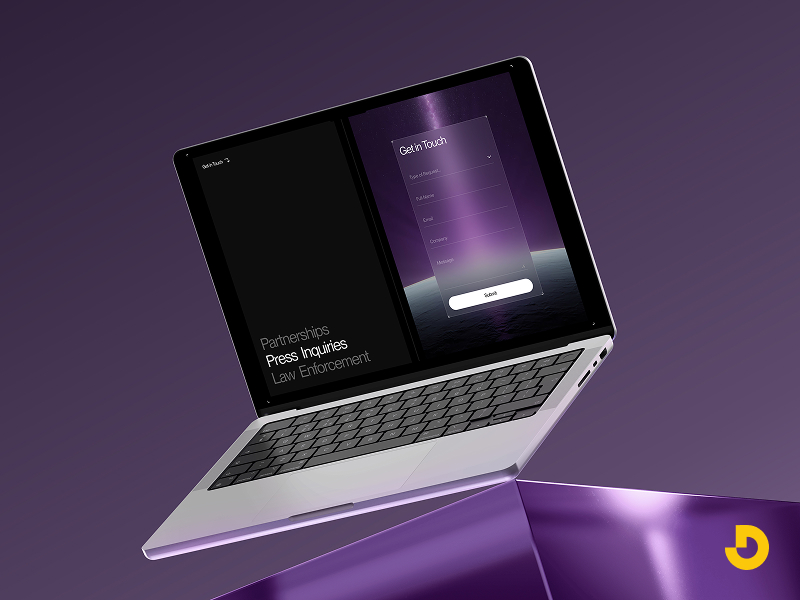
Sometimes a simple button isn't enough. If you need to collect information—like for a demo request or newsletter signup—a form makes sense.
Keep forms short. Studies show forms with three fields convert best. Only ask for what you'll actually use. If you don't need a phone number, don't ask for it.
Order fields logically. Start with name and email. Add optional fields later.
Make forms easy to complete. Use clear labels and enough space between fields. Avoid technical issues like layout shifts that frustrate users.
No landing page is perfect on the first try. Testing helps you find what actually works.
Common testing methods include:
Use tools like heatmaps and session recordings to see where people click and where they drop off. Then make changes based on data, not guesses.
A landing page isn't done once it's live. You need to track performance and make ongoing improvements.
Key metrics to watch:
Also track:
Small tweaks—like changing a CTA button color or adjusting form fields—can lead to significant improvements over time.
Even good pages can underperform due to avoidable errors.
Mistakes to avoid:
Clean, consistent design keeps the focus on the goal.
Here are practical ways to boost conversions:
At Designocracy, we focus on building landing pages that serve both your business goals and your audience's needs. Our process starts with understanding who you're talking to and what action you want them to take. We then design with clarity and test with data.

We don't rely on guesswork. Every design choice—from headline placement to button color—is informed by user behavior analysis and testing. The result is a page that feels simple to the user but is strategically built to convert.
| Common Question | Short Answer & Key Insight |
|---|---|
| What is the ideal conversion rate for a landing page? | 5.89% is average across industries; 10% or higher is considered excellent. Rates vary by offer type, audience, and traffic source. Focus on continuous testing rather than a fixed number. |
| How long should a landing page be? | No universal rule. Short-form pages work for simple signups; long-form pages perform better for complex offers (demos, high-ticket items). Provide enough detail to convince — but avoid fluff. |
| Landing page vs. homepage: what’s the difference? |
A homepage has multiple goals, navigation menus, and broad brand messaging. A landing page is built for one specific campaign, one offer, and one call to action — often removing navigation to reduce friction. |
| How do I test my landing page to improve conversions? |
✅ A/B testing (headlines, CTAs, images) ✅ Heatmaps & session recordings to see where users click/drop off ✅ Focus groups for direct feedback ✅ Multivariate tests to compare multiple elements at once Continuous iteration leads to compounding gains. |
| Why is mobile responsiveness critical for landing pages? | Most web traffic comes from mobile. A non-responsive page leads to high bounce rates. Essentials: responsive layouts, large tappable buttons, simplified forms, fast load times. Google also prioritizes mobile-friendly pages in rankings. |
A landing page that converts isn't about flashy design or clever tricks. It's about understanding your audience, removing friction, and making the next step obvious. Start with research. Keep the design clean. Test continuously. And always focus on delivering exactly what you promised.
When done right, your landing page becomes a reliable tool for turning visitors into customers. Whether you're building one yourself or working with a partner like Designocracy, the principles remain the same: clarity, trust, and a clear path forward.